A Comprehensive Guide To Effective Data Visualization With Matplotlib

I am a data analyst and a technical writer.
Introduction
Data visualization is a crucial aspect of data analysis, allowing you to communicate insights effectively.
This tutorial aims to introduce you to Matplotlib, providing a step-by-step guide on installation, basic plot creation, customization options, common plot types, and subplots.
To make the tutorial more practical, we will use a Counter-Strike 2 game dataset from Kaggle. The dataset provides a detailed view of the top 100 players' performance in Counter-Strike: Global Offensive video games. The variables include Rank, Name, CS Rating, Region, Wins, Ties, and Losses.
By the end of this tutorial, you will have a solid understanding of Matplotlib's capabilities and be able to create compelling visual representations of your data.
Matplotlib
Matplotlib is a widely-used Python library for creating 2D plots and visualizations. It provides extensive functionalities to generate various plots, charts, and graphs, making it an essential tool for data analysis, visualization, and scientific computing.
Installation
Matplotlib can be easily installed using the Python package manager, pip. Open a terminal or command prompt and run the following command
pip install matplotlib
Verifying the Installation
To ensure that Matplotlib is successfully installed, open a Python shell or a script and import the library:
import matplotlib.pyplot as plt
If no errors occur, Matplotlib is installed correctly.
Basic Plot Creation
Importing Matplotlib
Before creating plots, import Matplotlib as follows:
import matplotlib.pyplot as plt
Load the Dataset
df = pd.read_csv('counter_statistics.csv')

# To clearly show the difference in the visualization,
# I created a new dataframe "df2" to select the top 10 rows
df2 = df.head(10)
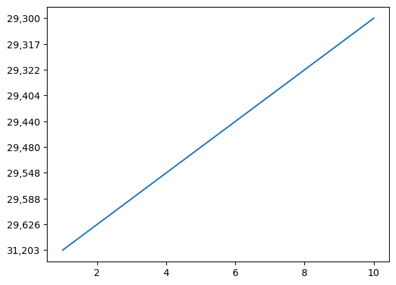
Creating a Simple Line Plot
A line plot can be generated by providing x and y coordinates to the plot() function. The plot() function allows you to visualize data in a graphical format.
For example:
# Line plot for CS Rating trends
plt.plot(df2['Rank'], df2['CS Rating'])

plt.show()
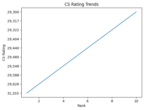
Adding Labels and Titles
You can add labels and titles to your plots to provide context.
Example:
In this example, I'll create a line plot for CS Rating trends.
# Creating a line plot
plt.plot(df2['Rank'], df2['CS Rating'])

# Adding labels to the axes
plt.xlabel('Rank')
plt.ylabel('CS Rating')

# Adding a title to the plot
plt.title('CS Rating Trends')

# Displaying the scatter plot
plt.show()
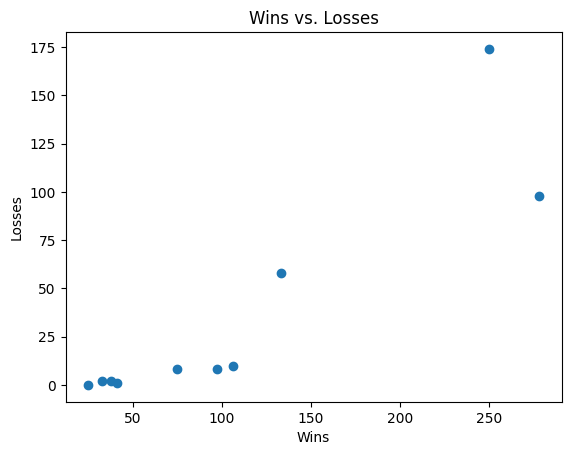
Creating a Scatter Plot
To create a scatter plot, use the scatter() function and provide x and y coordinates.
For instance:
# Creating a scatter plot
plt.scatter(df2['Wins'], df2['Losses'])

# Adding labels to the axes
plt.ylabel('Losses')
plt.xlabel('Wins')

# Adding a title to the plot
plt.title('Wins vs. Losses')

# Displaying the scatter plot
plt.show()
Customization
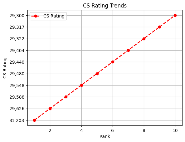
Customizing Line Plots
You can customize line plots by changing colors, styles, and markers.
Example:
# Customized Line plot

# 'linestyle': to specify the style of the line in a plot
# 'linewidth': to adjust the width of the line in a plot

plt.plot(df2['Rank'], df2['CS Rating'], color='red', marker='o',
linestyle='dashed', linewidth=2, label='CS Rating')
plt.xlabel('Rank')
plt.ylabel('CS Rating')
plt.title('CS Rating Trends')
plt.legend()
plt.grid(True)  # Show gridlines
plt.show()
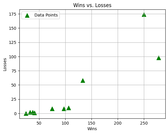
Customizing Scatter Plots
Scatter plots can be customized with colors, markers, and sizes.
Example:
# Customized Scatter plot

# 's': to set the sizes of the markers for each data point
plt.scatter(df2['Wins'], df2['Losses'], color='green', marker='^',
s=100, label='Data Points')
plt.ylabel('Losses')
plt.xlabel('Wins')
plt.title('Wins vs. Losses')
plt.legend()
plt.grid(True)  # Show gridlines
plt.show()
Common Plot Types
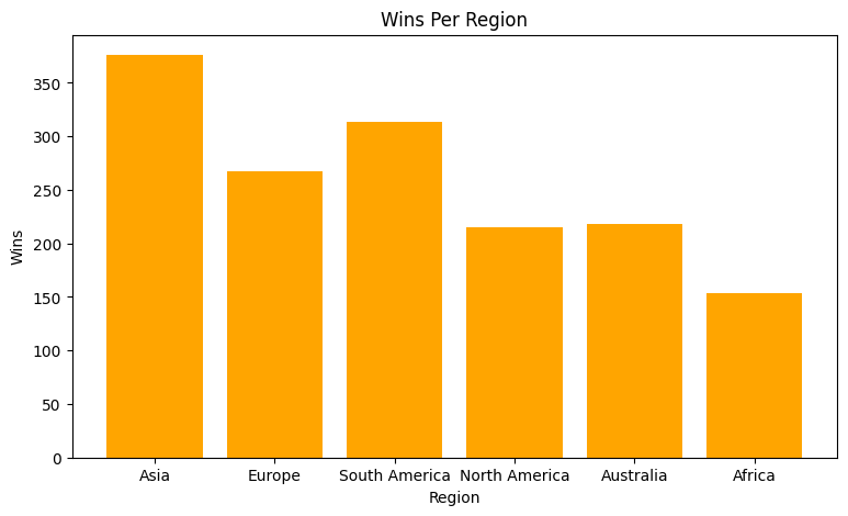
Bar Plots
Bar plots can be created using the bar() function.
Example:
In this example, I'll create a vertical bar chart representing the number of wins per region.
# Creating a vertical bar chart
plt.figure(figsize=(9, 5))
plt.bar(df['Region'], df['Wins'], color='orange')

# Adding labels to the axes
plt.xlabel('Region')
plt.ylabel('Wins')

# Adding a title to the plot
plt.title('Wins Per Region')

# Displaying the vertical bar chart
plt.show()
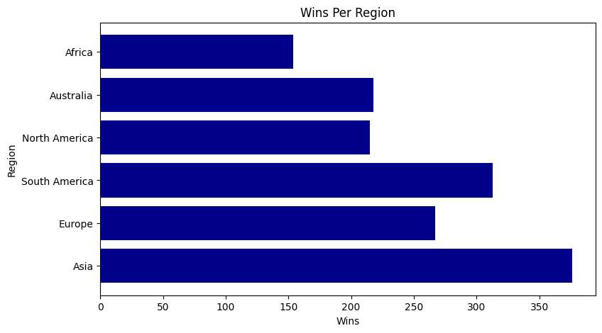
Horizontal Bar Plots
To create a horizontal bar plot, use the barh function.
Example:
In this example, I'll create a horizontal bar chart representing the number of wins per region.
# Creating a horizontal bar chart
plt.figure(figsize=(9, 5))
plt.barh(df['Region'], df['Wins'], color='darkblue')

# Adding labels to the axes
plt.xlabel('Wins')
plt.ylabel('Region')

# Adding a title to the plot
plt.title('Wins Per Region')

# Displaying the horizontal bar chart
plt.show()
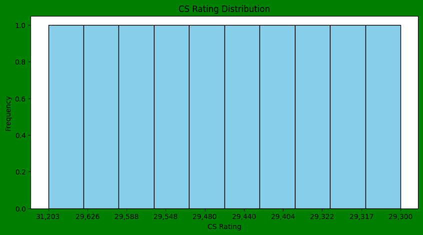
Histograms
Histograms can be generated using the hist() function.
Example:
In this example, I'll create a histogram representing the distribution of CS Rating
# Create a new figure with custom properties

plt.figure(figsize=(10, 5),   # Set figure size (width, height) in inches
           facecolor='green', # Set the background color
           edgecolor='black') # Set the edge color

# Create the histogram
plt.hist(df2['CS Rating'], bins = 10, color='skyblue', edgecolor='black')

# Adding labels to the axes
plt.xlabel('CS Rating')
plt.ylabel('Frequency')

# Adding a title to the plot
plt.title('CS Rating Distribution')

# Displaying the histogram
plt.show()
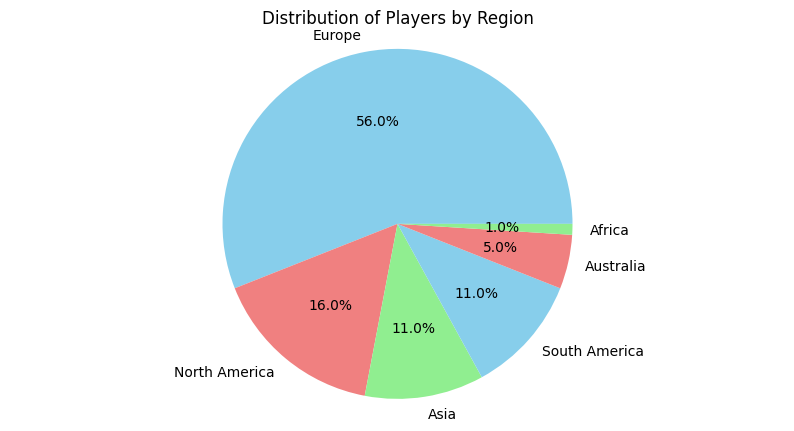
Pie Charts
Pie charts can be created using the pie() function.
Example:
In this example, I'll create a pie chart representing the distribution of players in different regions.
# calculates the counts of unique values in the 'Region' column
region_counts = df['Region'].value_counts()

# Set figure size (width, height) in inches
plt.figure(figsize=(10, 5))

# Creating a pie chart
# autopct='%1.1f%%': displays the percentage values inside each wedge.
plt.pie(region_counts, labels=region_counts.index, autopct='%1.1f%%',
colors=['skyblue', 'lightcoral', 'lightgreen'])

# Adding a title to the plot
plt.title('Distribution of Players by Region')

# Equal aspect ratio ensures that pie is drawn as a circle.
plt.axis('equal')

# Displaying the pie chart
plt.show()
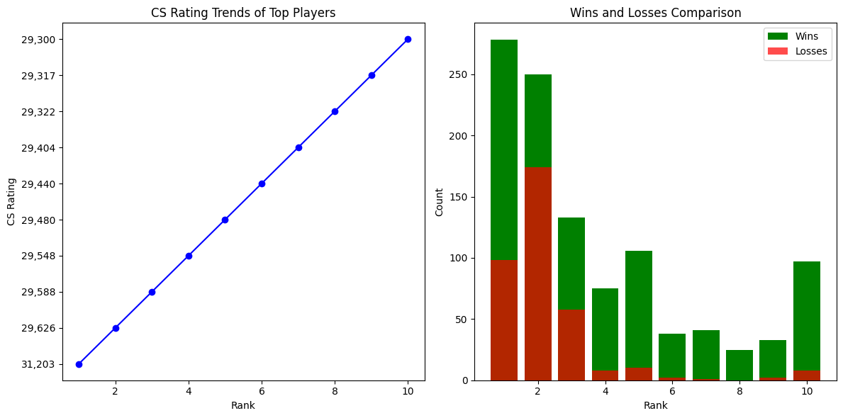
Subplots
Subplots in Matplotlib allow you to create multiple plots within the same figure, arranged in a grid layout. This can be useful when you want to compare multiple plots or visualize different aspects of your data side by side.
Example:
In this example, I'll create two subplots: one for a line chart showing CS Rating trends, and another for a bar chart comparing the number of Wins and Losses for each player.
# Subplot 1: Line chart for CS Rating trends
plt.figure(figsize=(12, 6))
plt.subplot(1, 2, 1)  # 1 row, 2 columns, index 1
plt.plot(df2['Rank'], df2['CS Rating'], marker='o', linestyle='-',
    color='blue')
plt.xlabel('Rank')
plt.ylabel('CS Rating')
plt.title('CS Rating Trends of Top Players')

# Subplot 2: Bar chart for Wins and Losses comparison
plt.subplot(1, 2, 2)  # 1 row, 2 columns, index 2
plt.bar(df2['Rank'], df2['Wins'], color='green', label='Wins')
plt.bar(df2['Rank'], df2['Losses'], color='red', label='Losses', alpha=0.7)

# Adding labels to the axes
plt.xlabel('Rank')
plt.ylabel('Count')

# Adding a title to the plot
plt.title('Wins and Losses Comparison')

# Adding Legend
plt.legend()

# Adjust layout for better spacing
plt.tight_layout()

# Show the subplots
plt.show()
Conclusion
Matplotlib is a powerful and versatile library for creating various plots and visualizations in Python.
This tutorial provided an overview of Matplotlib, covering installation, basic plot creation, customization options, common plot types, and subplots.
With the knowledge gained from this tutorial, you can confidently utilize Matplotlib to visualize and communicate your data effectively.
For more in-depth learning, refer to the official Matplotlib tutorials at https://matplotlib.org/stable/tutorials/index.html.

